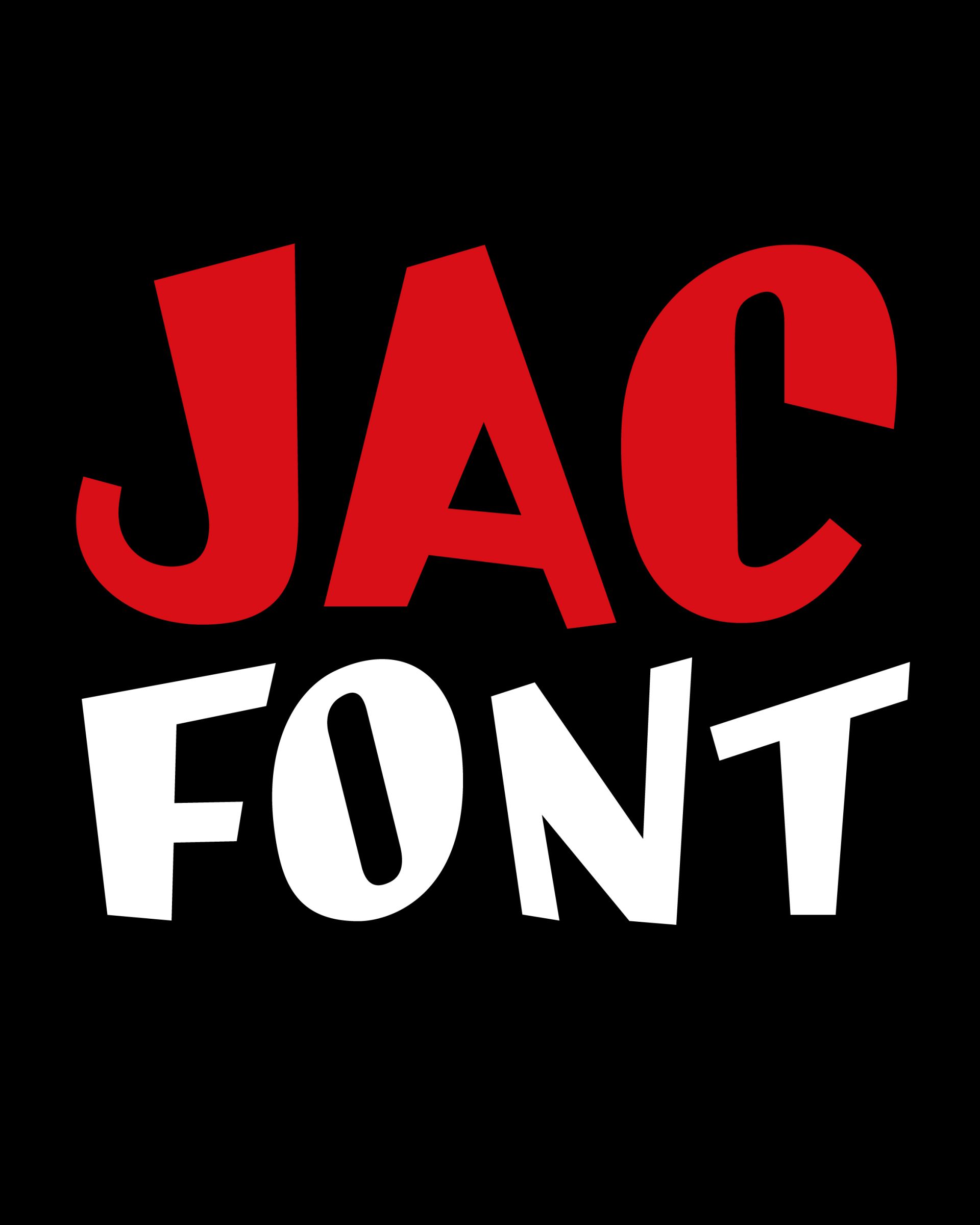
JAC
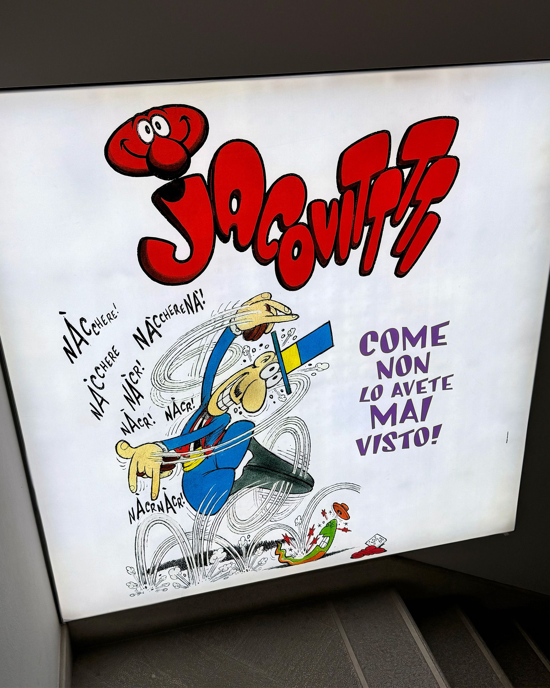
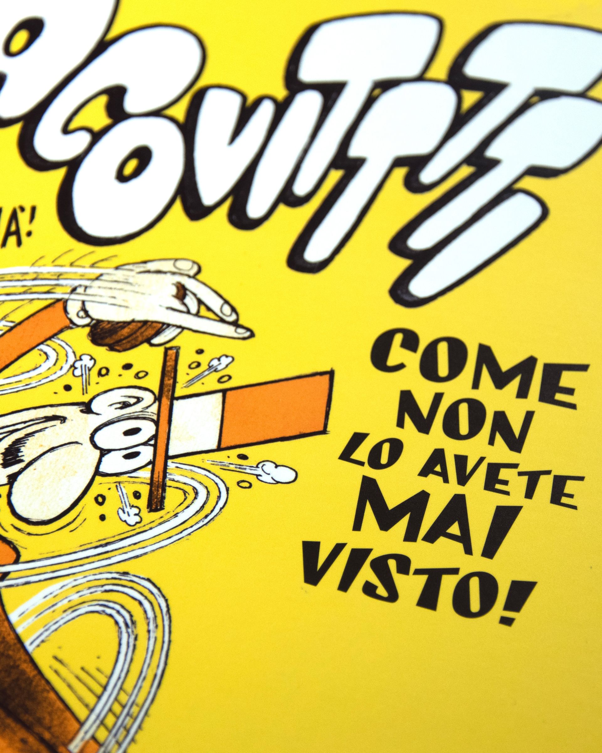
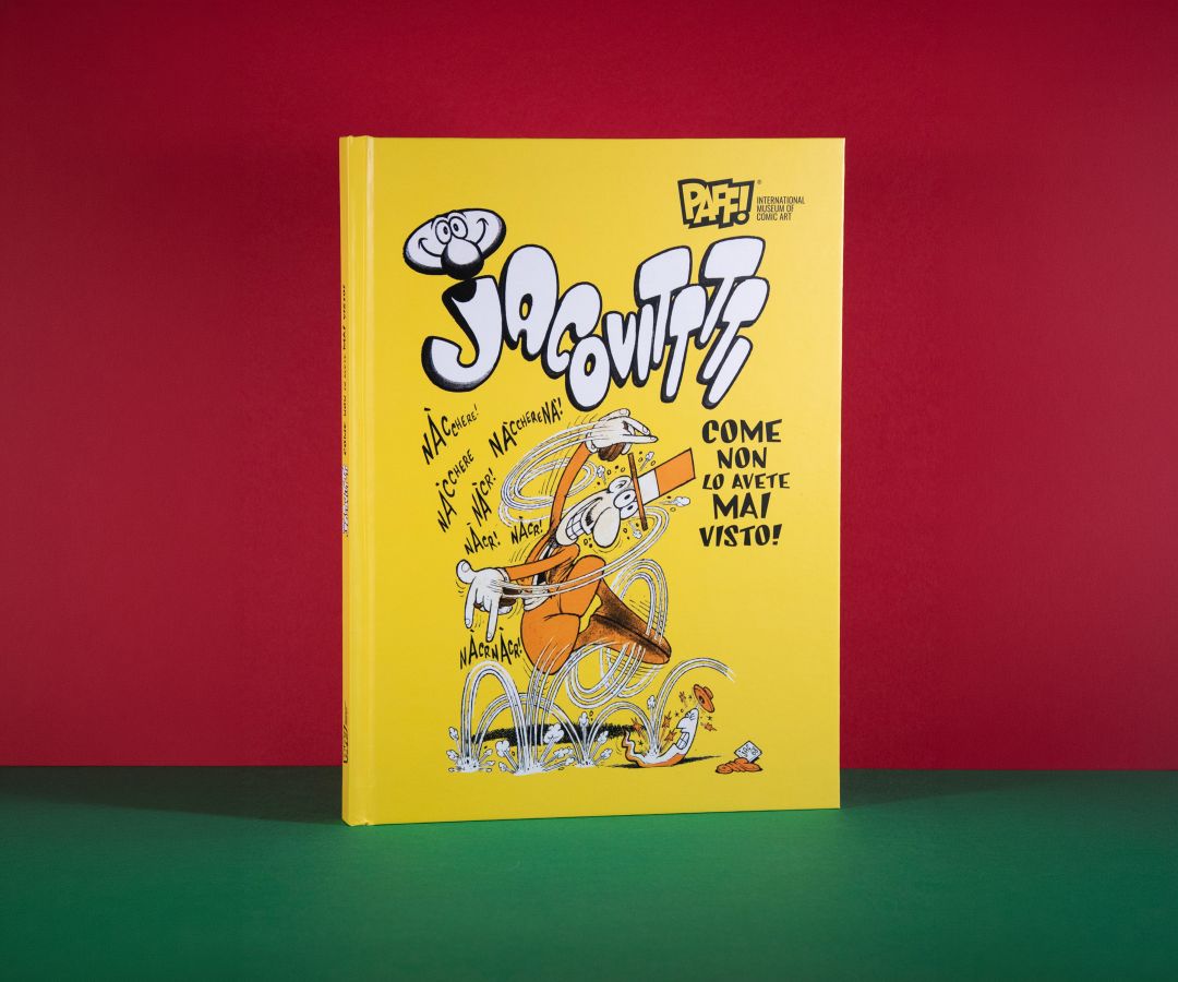
JAC is a display typeface developed from the original lettering of Benito Jacovitti, one of the most recognizable and unconventional artists in the history of Italian comics.
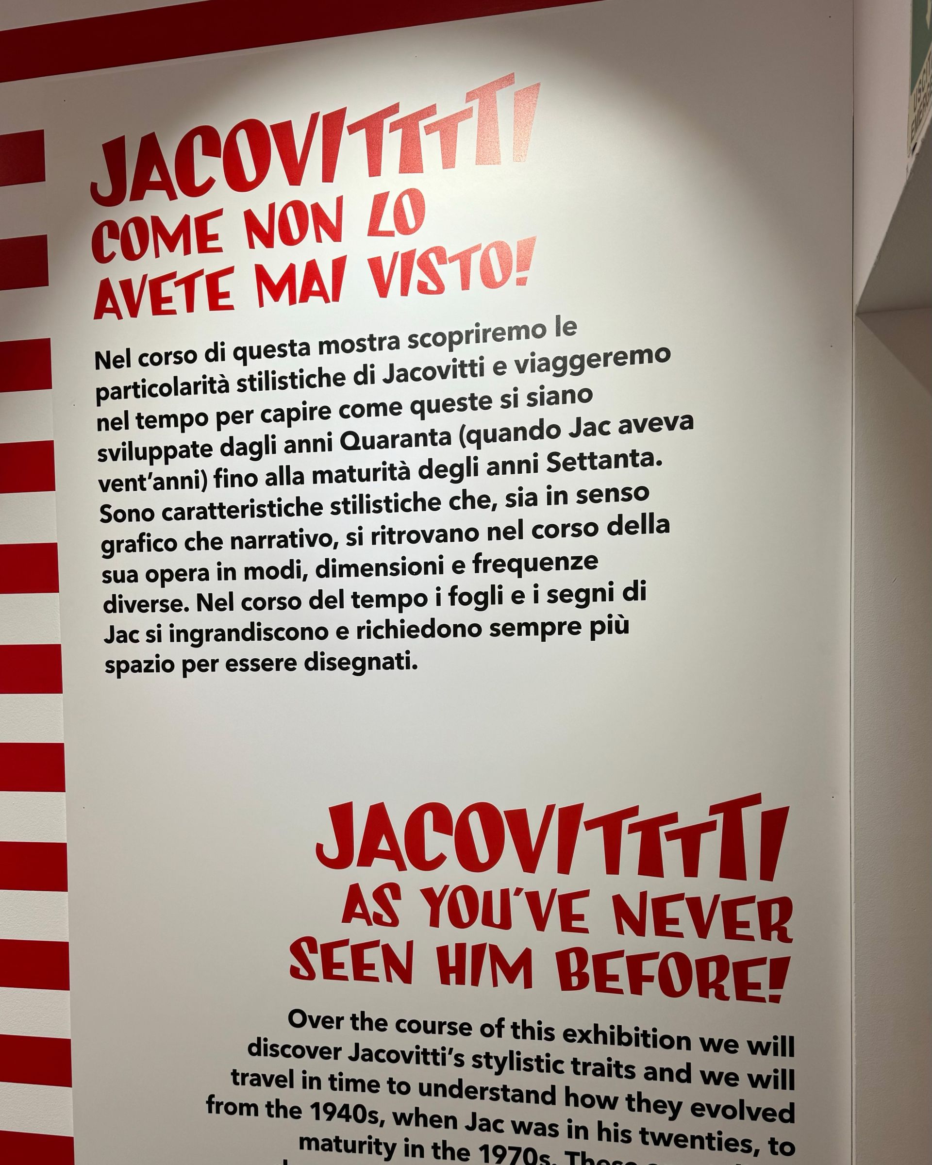
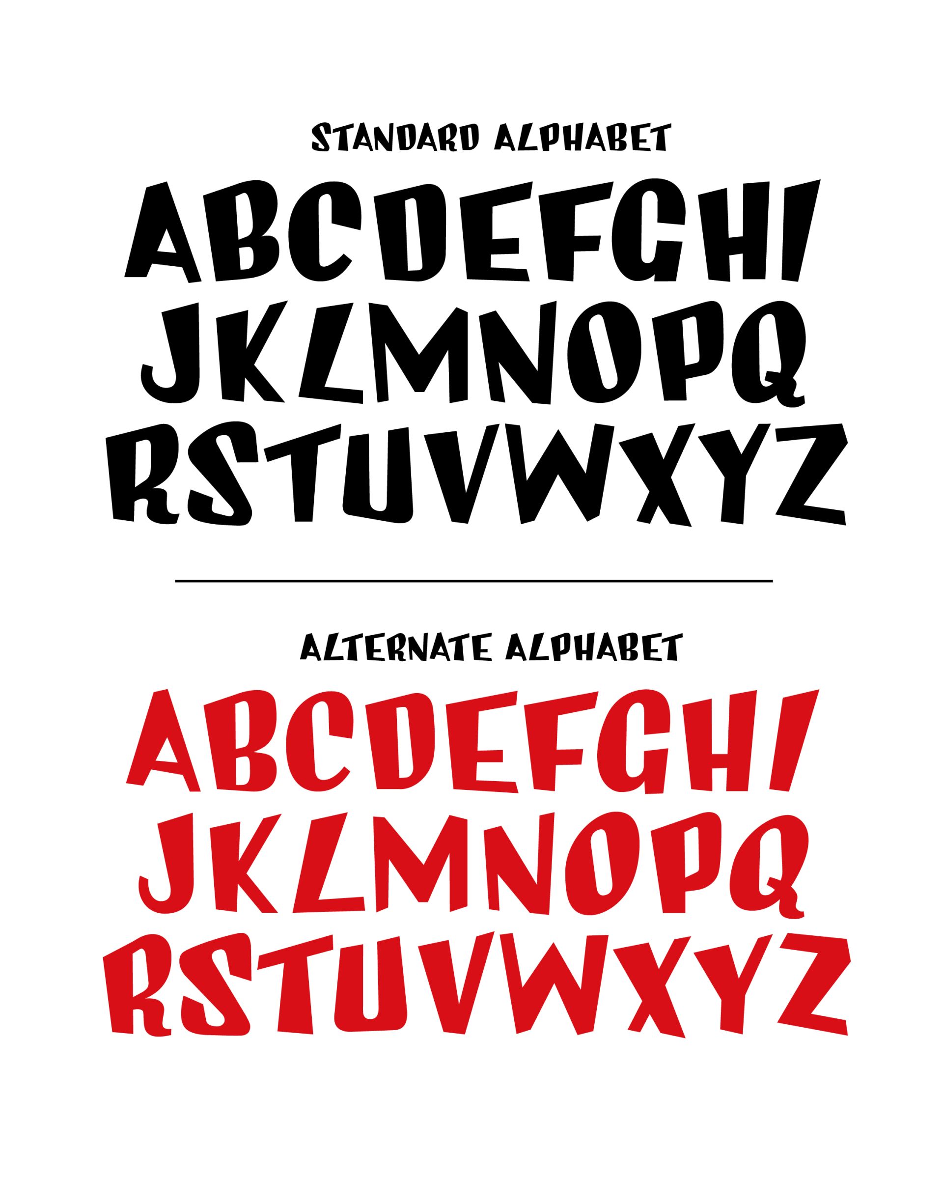
The project originates from the study of a famous alphabet chart in which the cartoonist created two complete sets of uppercase letters, transforming the alphabet into an exercise in graphic invention and visual humor. Like Jacovitti’s entire body of work, the typeface exists in a space between drawing, caricature, and storytelling, where each letter possesses its own personality and contributes to the construction of an immediately recognizable visual universe.
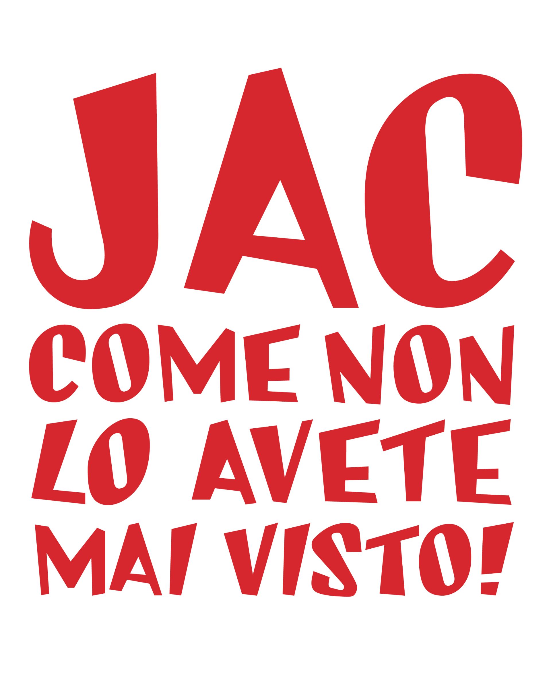
Morphologically, JAC is characterized by irregular and intentionally unstable forms, combining elementary geometry with expressive distortion. The letters feature varying proportions, inclined strokes, oblique terminals, and asymmetrical counters that create a lively and unpredictable visual rhythm. While maintaining a compact and legible structure, the typeface avoids the rigidity of traditional typography, favoring a spontaneity that recalls the rapid and narrative-driven line of comic art. The inclusion of two complete uppercase sets also allows for variation within compositions, further enhancing the playful character of the alphabet.
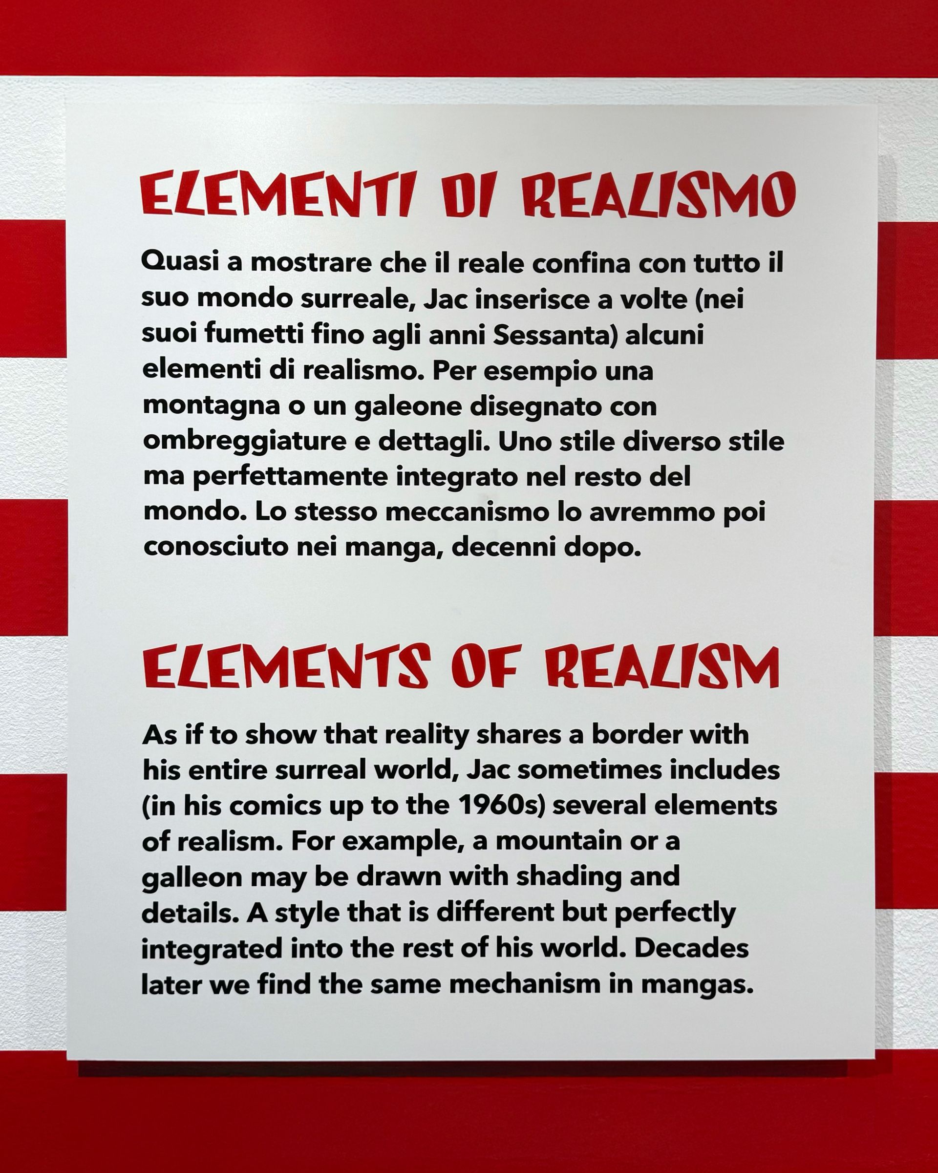
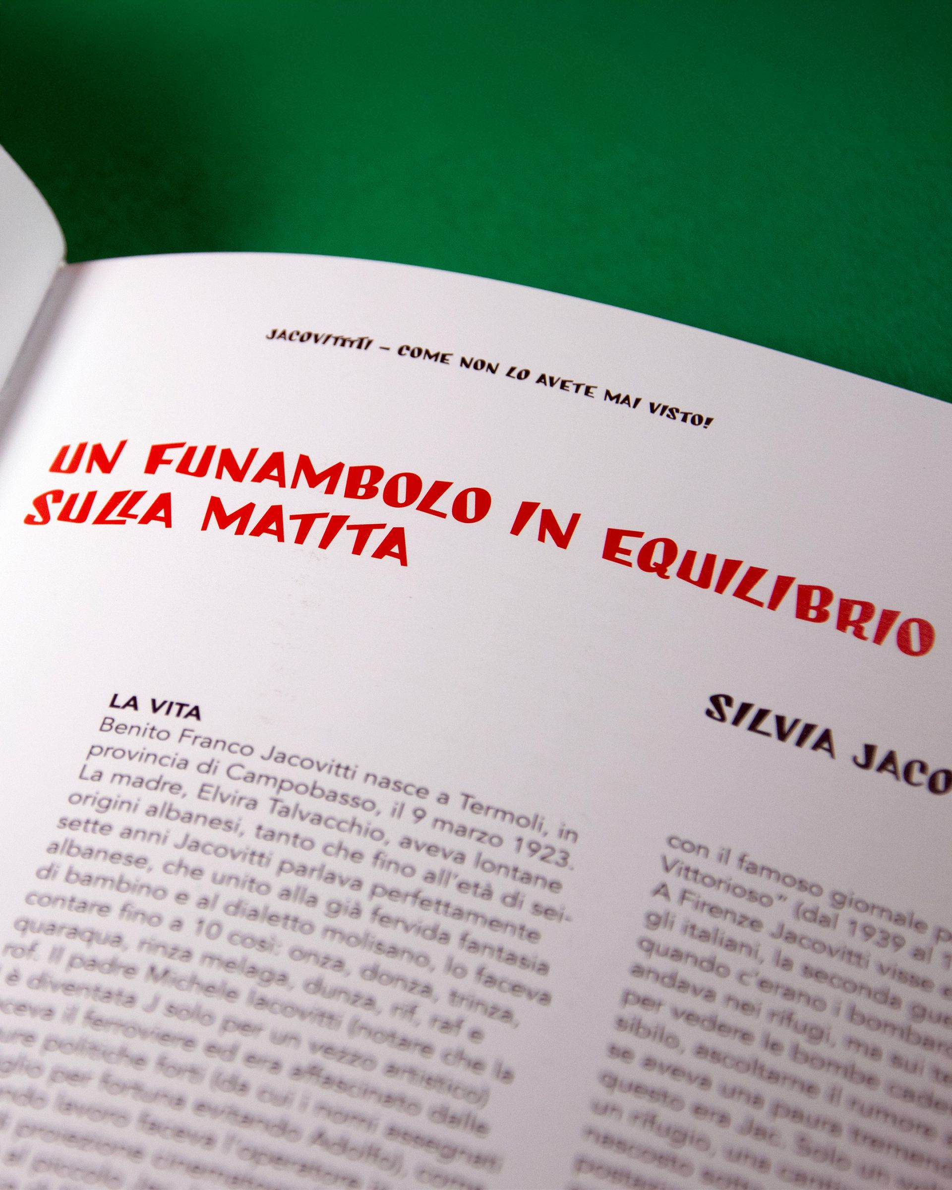
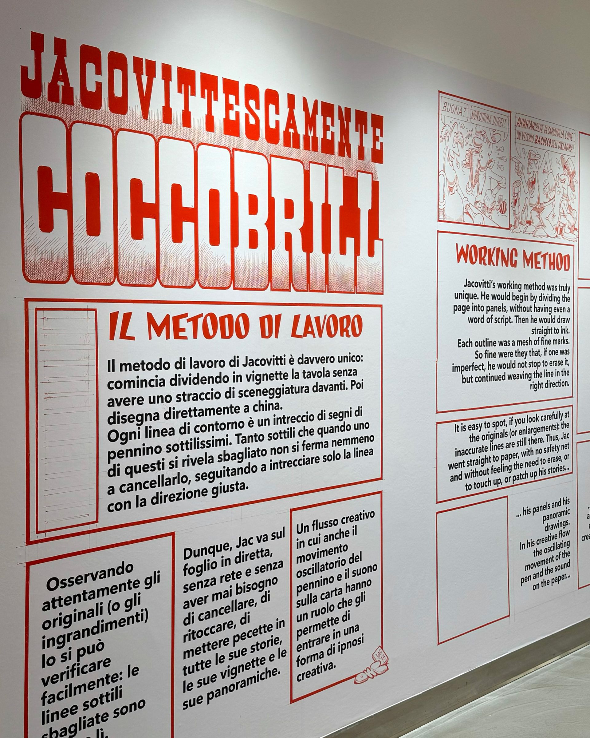
Designed for titles, illustrated publishing, comics, packaging, and cultural projects, JAC pays tribute to Jacovitti’s surreal and ironic imagination, transforming his graphic language into a contemporary typographic tool capable of conveying energy, humor, and expressive freedom.
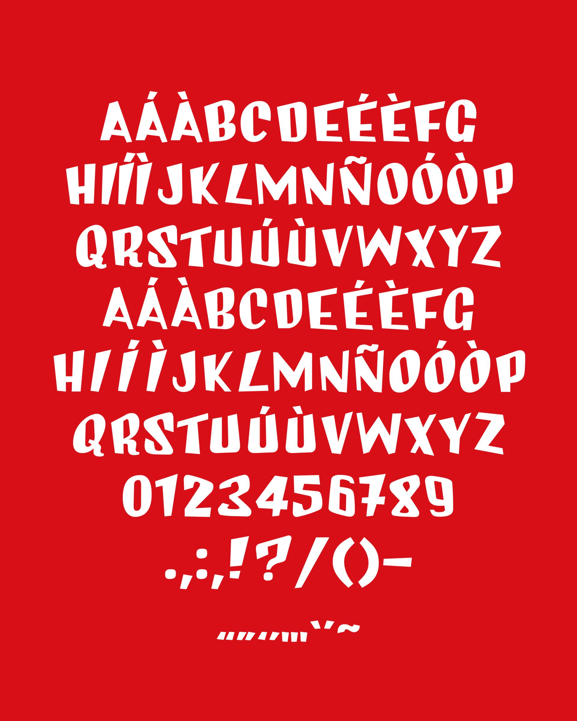
Glyphs
Basic Latin
Latin-1 Supplement
Latin Extended-A
Font in use